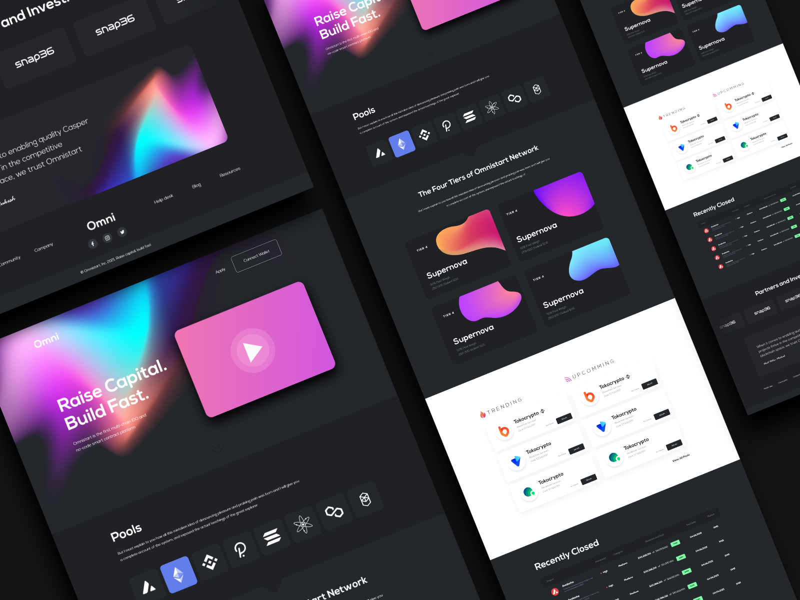
Learn more about responsive web design and how it helps you adapt your website to all devices. Here are tips for a great user experience.
Responsive web design is not a trend or a buzzword anymore. It’s clear that websites that adapt seamlessly to the user’s device are here to stay. But for some marketers and small business owners, it’s still challenging to ensure true responsive design.
Today, you can’t just design for desktops and mobile devices. Devices come in so many sizes that you’ll need to create websites that look great on the following:
Creating a good user experience is essential to ensuring high website conversion rates and the best chance at developing leads that you can nurture into new customers. This complete guide to responsive websites can help you prepare for building valuable experiences customers enjoy.
Responsive web design is a website that adapts to various screen sizes. While you can use multiple columns for the desktop version of your site, your mobile site will likely be one column and your tablet version might be one or two columns depending on the tablet’s size.
Essentially, when your website uses responsive design, it delivers a custom experience based on the user’s device.
Responsive design is different from adaptive design. That’s because, while responsive design renders differently, adaptive design shows completely different versions of the same website. While each presents a solution to making websites look great on all devices, they function differently.
Websites that are responsive use the same design file to render the website, but the CSS code adapts to the screen size. However, an adaptive website assesses the device accessing the website and then chooses the template for that device.

As you evaluate whether a website redesign project is worth it for your company, consider these benefits of responsive websites.
Yes, WordPress is an extremely flexible platform that offers ease of maintenance and speed of getting a website up and running. But what you have to stay aware of is that the responsiveness of your website will be highly dependent on the theme you use. And when trends or design methods change, you might need to make manual changes to your theme to update it unless the publisher decides to make the updates for you.
You can tell how well your WordPress theme adapts to various devices by using Chrome Developer Tools.
One thing to watch out with using free WordPress templates is that they can be fairly slow. That’s because they have excess code in them to meet the needs of various brands and use cases. While it has a higher upfront cost, it’s better to pay a website designer for their services and know that it will come back to you in the form of new business through improved SEO ranks, user experience and website speed.
One aspect of designing for a variety of screen sizes is understanding those screens and choosing “responsive breakpoints.” Here’s a look at the most common screen sizes from smallest to largest.
Designers who use a mobile-first approach start with the smallest design and then provide larger designs from there. That way, you aren’t shrinking down a full-size site and watching your font sizes get too small or constraining to the point where media no longer fits.
When building your website’s responsive design, consider these tips to get the most from your project.
If you cater to the largest and smallest screen sizes, you’ll end up with an outstanding website across various sizes. Starting with the smallest viewport helps ensure that your website renders well on small mobile devices. Then you can have more creative freedom as you design a website for desktops.
While designing for small viewports, don’t forget that users will be navigating using clicks and swipes. Dropdown or expandable menus or complex animations will be more challenging to navigate from mobile.
It’s challenging to design a website for every viewport. Instead, it’s better to target several viewports and test the site using various breakpoints.
See what happens between breakpoints. This will ensure columns collapse the way they should and that the site looks great even on large smartphones or smaller tablets that don’t fit the norms. Build additional wireframes for those in between breakpoints and test the site repeatedly.
Add a feedback button to your website. Often, these are in the top or bottom right corners. That way, if a user has a challenging experience or sees opportunities for improvement, you’ll be ready to receive that feedback.
Complete frequent usability tests or watch for changes in website traffic trends. Changes in website traffic and trends could tell you that something isn’t functioning the way it once was or that something with your responsive design needs tweaks.
Building a responsive website requires deep technical knowledge. Web designers spend years perfecting their craft and staying up to date on changes and trends in website design. Instead of trying to go it alone, you should hire a skilled website design agency. And if you’re taking the time to overhaul your website, it’s smart to also go with an agency that knows how to build a website optimized for search engine results as well.
New Light Digital is a digital marketing agency with vast experience in web design and development, SEO, PPC, content marketing and more. We can help you with every aspect of your website from design to content. Schedule your free consultation now to start your project.
Further reading: