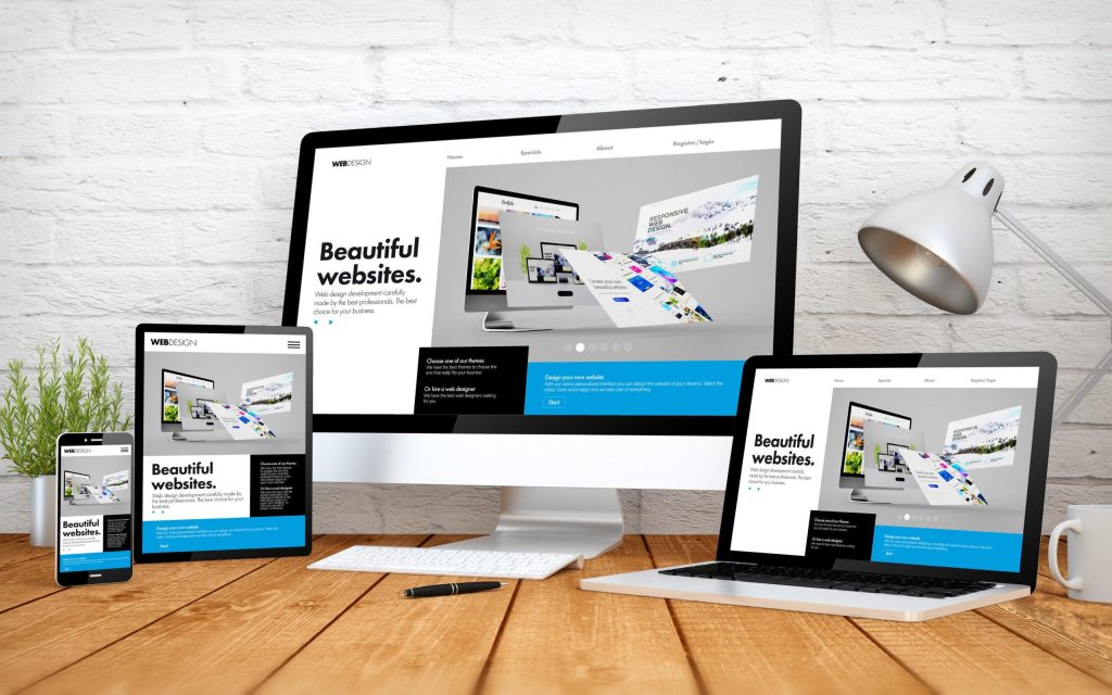
When the internet started, you could be certain what type of device a person would visit your site from – a computer. But today, users can access information from a variety of devices including desktops, laptops, tablets and smartphones. Others gain information from smart home devices and never see the physical website.
Today, websites should have a mobile-first design. That’s because 58 percent of all website traffic was from mobile devices as of the end of 2023.
People can surf the web or look up information from anywhere, anytime. Mobile devices have added a level of convenience to technology that we couldn’t fathom just a few decades ago.
Because of that, you might need to consider a website redesign project that helps you welcome mobile visitors and make their browsing experience simple and enjoyable. Here’s what you need to know about designing websites for mobile devices.
Mobile-first Design Explained
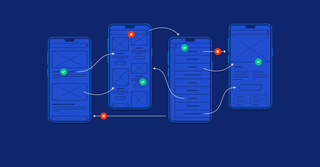
Website designers who use a mobile-first design focus on the experience that those with the smallest smartphone screens will experience. This starts with wireframes or sketches that showcase the experience for these users.
Once they have a design everyone is comfortable with, the designer will create additional sketches for larger screens.
By starting with the smallest screens, the design team can ensure that website elements do not get lost on those small screens. Additionally, this approach requires the designer to be picky about what elements to include. That way, the site stays as simple as possible while still serving the visitor’s needs.
Considerations for a Mobile-first Approach to Website Design
As you shop for a talented website designer, look for these crucial elements of a mobile-first website approach.
1. Page Content Prioritization
When designing mobile web pages, you want to consider what information is most important. What elements do you want the user to be welcomed with when they first enter the site? The smaller the screen, the less the user will see without scrolling or clicking. That requires strict prioritization and a keen understanding of why the user is visiting your website.
Critical elements should be visible, such as the menu, a clear call to action and some content that showcases your key market differentiator as best as you can with the limited space.
2. User-friendly Navigation
Navigation is essential no matter the device. However, making navigation simple on mobile can be harder because dropdowns and expanded content can be harder to navigate on a touch screen. You want a clean navigation system when completing a mobile-first design.
You might consider using navigation that uses a hamburger menu or drawers to allow for displaying secondary elements.
3. Limit Pop-ups
Since space is limited on mobile devices, you want to use pop-ups sparingly. It’s not to say you can’t do it, but you should have a good reason for using a pop-up and it should be extremely easy to close. Too many pop-ups today have tiny pieces of text to close instead of a clear X in the upper corner or the capability to just scroll or click outside the box to close.
Looking for a Results-Driven Marketing Agency?
4. Extensive Testing
Mobile devices can read and display websites in ways you aren’t anticipating. When undergoing a redesign of your website, you should test it extensively on various devices. Be sure you aren’t reviewing drafts only on your work computer because this won’t be an accurate depiction of how 58 percent of users view your site. And depending on the industry you’re in, that percentage could be far higher.
If you can, test the site on various mobile devices and device manufacturers to better understand what the real user conditions will look like.
5. Keep Copy Concise
We live in the TLDR age where long blocks of content look overwhelming to the average person. Instead, your content should be simple and clear. Less is always more and when you can tell a story with a visual element instead of text, that’s far better because it will keep your site clean and attractive to visitors.
6. Ensure the Site is Fast
Website speed is an essential element no matter the device that a user is visiting from. But mobile requires even more image compression and minimal code for the best load times. Run your website through speed tests and look for ways to speed things up so that users have a great experience.
7. Include Visual Cues and Feedback
You can tell consumers more about your products or services using visual cues and feedback. Some ways to do this include animation and color.
8. Review Web Stats to Inform Decision Making
You already have a great start with whatever website you have. You can gain great insights from the activities that visitors complete while on your site. What they visit or fail to visit can tell you a great deal. Use this data to inform your decision-making.
For example, you might see that certain pages on your site get plenty of visits from desktops but minimal visits from mobile. That might be because they are harder to reach via a mobile device. It doesn’t mean the page is obsolete, but that you need to revise your navigation to make it easier to reach from various device types.
9. Make Touch Targets Large Enough
Nothing is more frustrating than trying to click on something and instead clicking somewhere else or not getting where you thought you would. That can happen when a touch target is too small. In those cases, they are challenging to click on or you might accidentally click the wrong thing.
10. Design as if the Website Were an App
While you likely don’t have the budget to design a native app, you want to think about your website as if it were an app. That will help you build outstanding experiences that make your users want to return. When you design like your website is an app, you’ll provide an outstanding mobile experience. This will include expandable widgets that make it easy to interact with the site.
Finding High-quality Mobile-first Designers
Ultimately, the designer you select should know these considerations for mobile-first design and put your site through rigorous testing without you asking for it. But sadly, there are many sub-par website design companies out there.
New Light Digital is a mobile-first design company that also specializes in a variety of other digital marketing initiatives, including SEO. That way, you get a site that isn’t just great for mobile visitors but is optimized for organic website traffic to help you reach your audience to drive traffic. Schedule a free consultation now to get started.
Further reading:
- Digital Marketing Services Price List – How Much Does It Cost in 2024
- Ranking for Local Search: Strategies to Attain the Highest Position
- On Top of Local Search: Strategies to Attain the Highest Position
- The Importance of Site Indexing: How Search Engines Catalog and Display Your Pages
- AI Chatbot Integration: Embedding Chat Functionality on Your Website